
Brooklyn Public Library
Navigation Redesign

Project Logistics
Timeline
1.5 Weeks
My Role
Information Architect
Our Team
Chris Aflague
Nancy Che
Project Overview
As one of the nation’s largest public library systems, Brooklyn Public Library system is recognized for its significant and exceptional contributions to the communities in Brooklyn. In response to the current pandemic, the Brooklyn PublicLibrary (BPL) website has become the main tool for browsing services, borrowing books, and attending their online classes.
More library patrons were experiencing difficulties while using the Brooklyn Public Library website. The main issues are locating information regarding ebook availability, as well as keeping up with the newly released titles in the Brooklyn Public Library.
Scope of Work

Our team set out to explore and discover ways to improve the patron’s navigation experiences on the website.
We studied the existing client website, as pictured here, extensively through a tree study, open and closed card sorts, and a heuristic evaluation.
We then took our findings from the existing website and created a proposed navigation design. This update was then also tested via a tree study and closed card sort, allowing us to compare the results to the existing website results.
The Challenge
It is difficult to find titles that are currently in stock at the Brooklyn Public Library. As a result, library patrons have difficulty finding non-fiction books that are available to borrow now.
How might we provide access to information on which titles are available to borrow in real time?
Understanding the Market
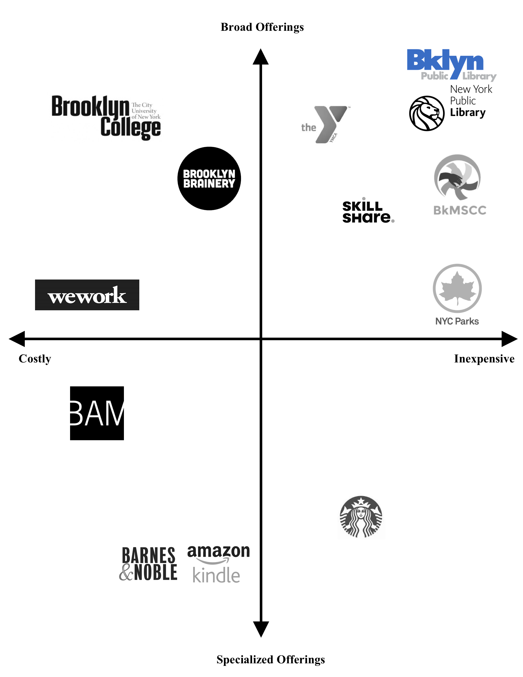
Competitive Matrix
In order to identify trends, standards, and best practices, we conducted a series of competitive analyses. A competitive matrix was generated to visually rank the organizations that have similar value propositions to Brooklyn Public Library, on a spectrum of two measurable parameters: cost and service specificity.
Our competitive matrix indicated that Brooklyn Public Library (shown in color) is the most inexpensive entity that offers the most varieties of services.
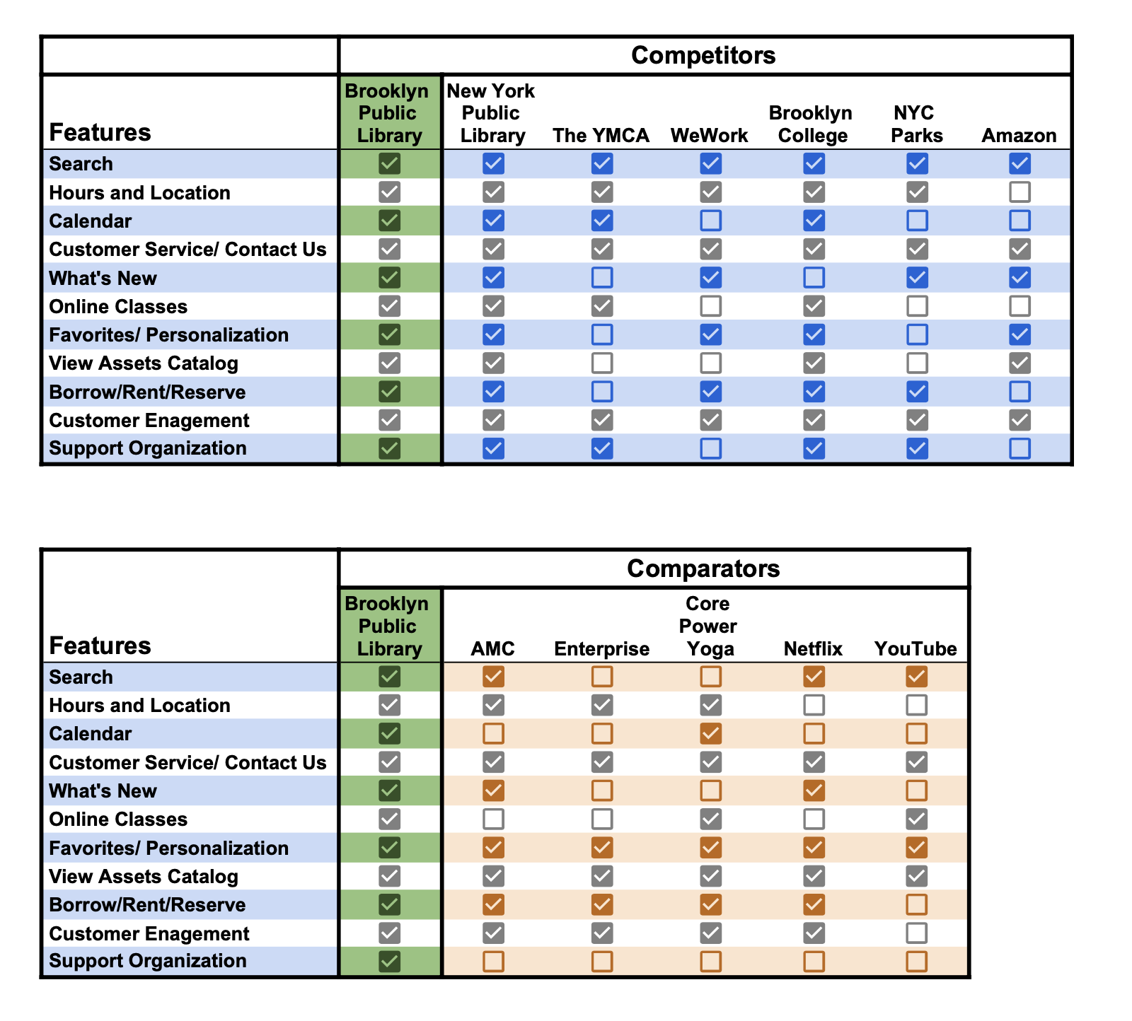
Feature Analysis
We conducted a feature analysis, comparing the Brooklyn Public Library to some of its competitors and comparators to assess the website offerings and shortcomings.
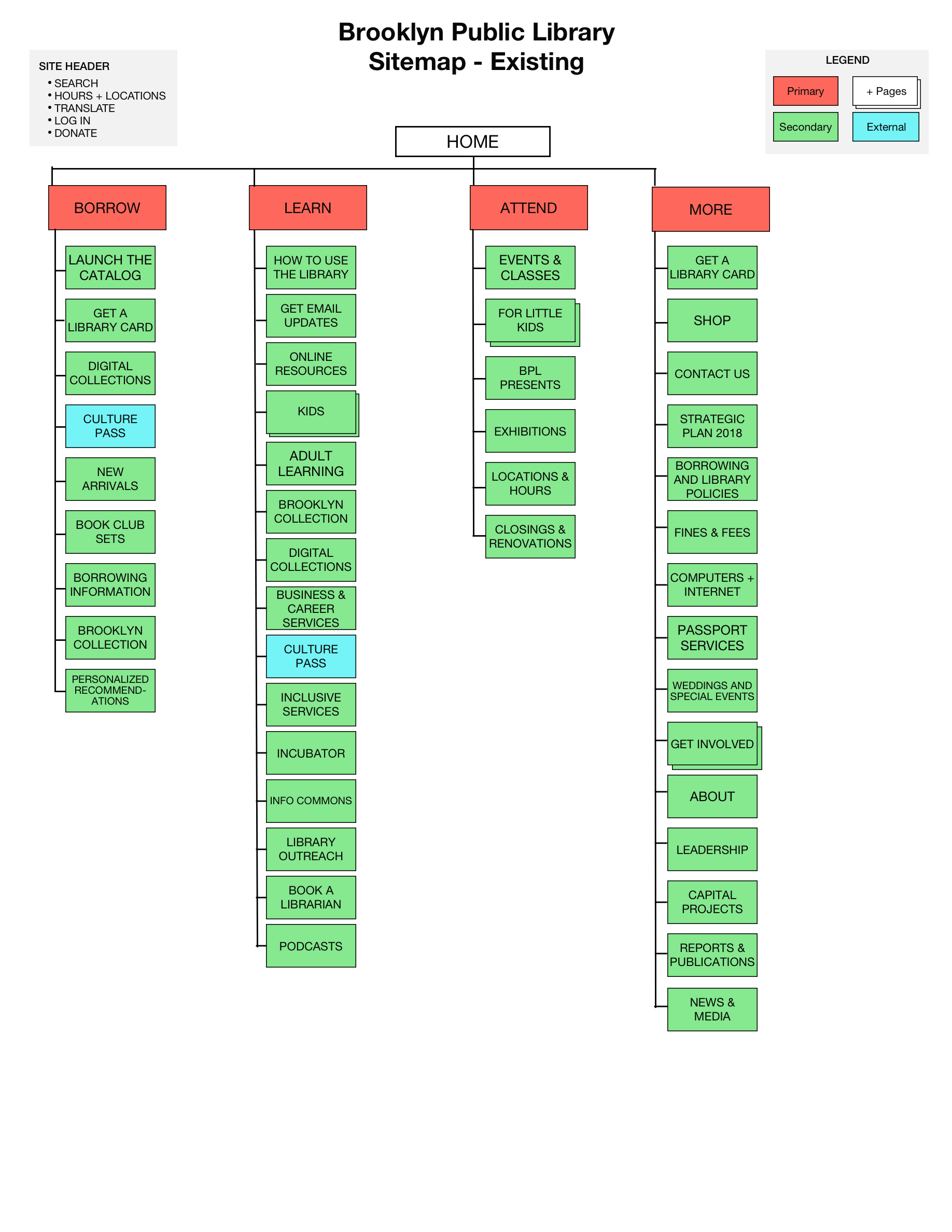
Site Map, Existing
The existing navigation has 4 primary categories; Borrow, Learn, Attend and More. There are over 60 secondary navigation items under the primary categories.
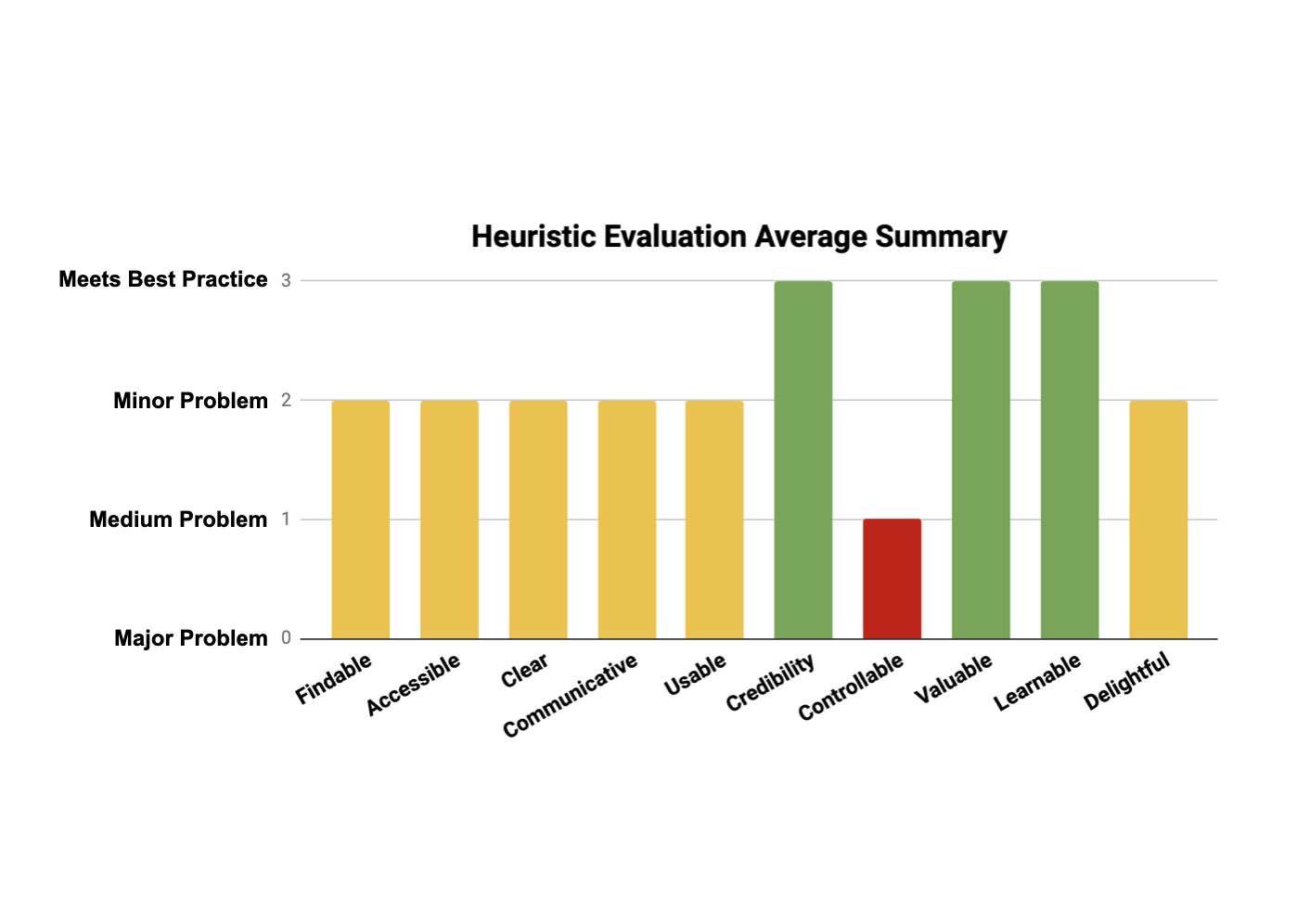
Heuristic Evaluation
To assess the current state of the website against best practices, we undertook a heuristic evaluation of the existing site using Abby’s Method. Some of the main takeaways were:
Findable - Many secondary navigation items are greyed out and displayed in paragraph form, separated by commas. This makes it extremely difficult for the user to quickly parse through the list of pages.
Clear - The BPL Target demographics’ grade and reading level were considered, however some labels are unclear in their wording, regardless of the reading level.
Communicative - Within the site, the user’s location is not communicated as they progress through a task, therefore they might get lost or confused throughout the process.
Controllable - Some pages open into new browser tabs, while others remain in the current tab. Inconsistencies such as this provide the user with less perceived control on how the site works. Additionally, some filtering options within the catalog search do not function as intended, leaving the user frustrated and not in control. The repeated video loop on the home screen is distracting and difficult to turn off.
Understanding the User
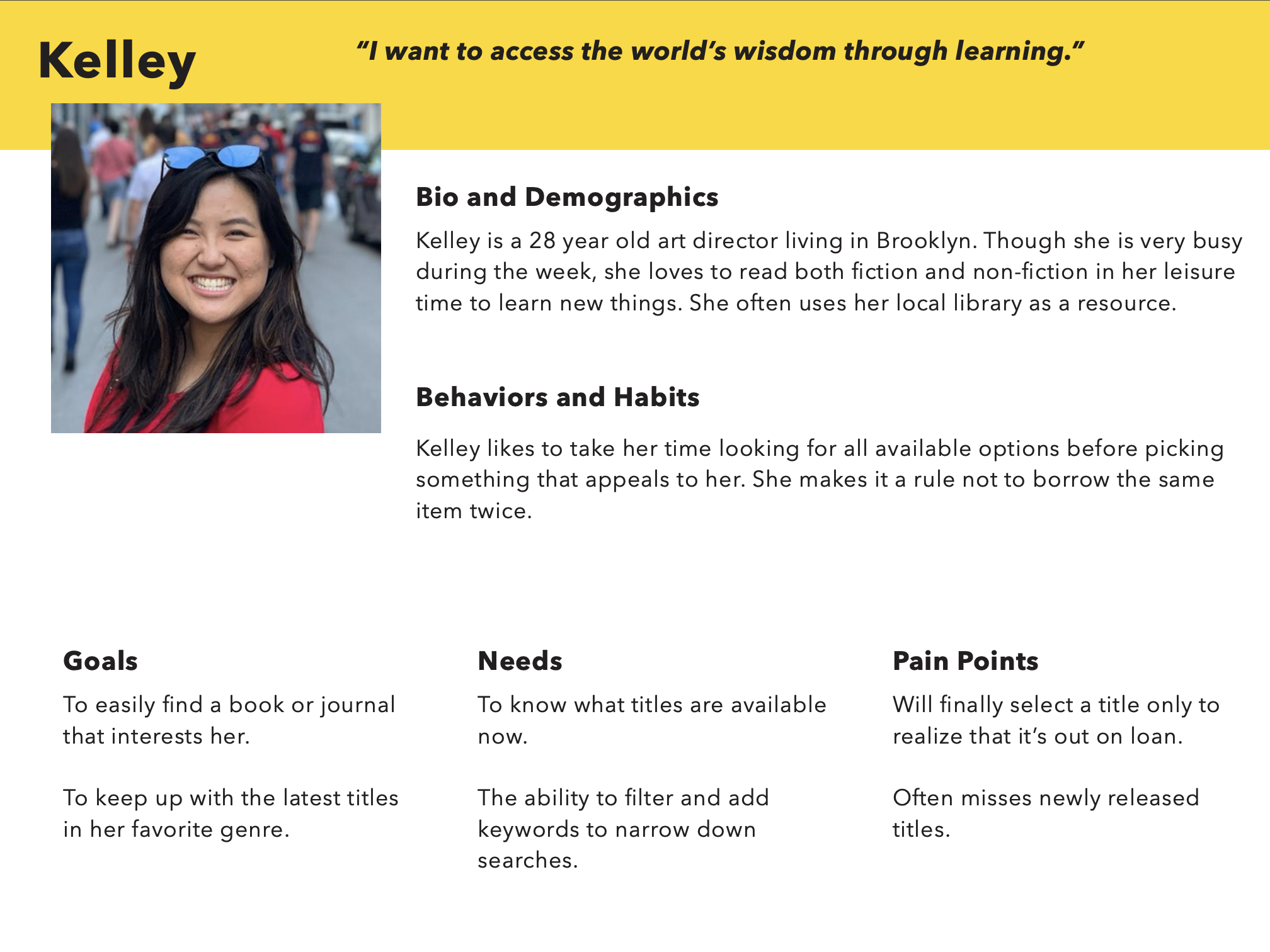
Our Target User
Our target persona, provided to us, is Kelley. She is a 28 year old art director living in Brooklyn who wants to know which non-fiction titles are available now.
Tree Study on Existing Website
A tree study was conducted in order to evaluate the effectiveness of the site’s current labeling taxonomy. Three scenarios and tasks, modeled after our persona Kelley, were chosen to examine participants directness and time on task.
Task 1 - Browse non-fiction latest releases
Task 2 - Find a virtual book club
Task 3 - Make a single contribution of $35 to the Brooklyn Public Library
Participants had the most difficulty with Task 1. First-click data indicated that 75% of first clicks began directly, implying a breakdown in the secondary navigation.
Card Sorting on Existing Website
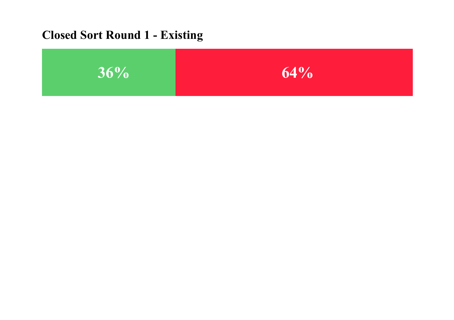
Our team used the research technique of card sorting, both open and closed, to help us understand users’ mental models and how they might sort information or want to find information on the BPL’s website.
Closed: Only 36% of the secondary level cards were placed inside the existing primary categories. Labeling seemed to lead to confusion about the content of information within respective pages.
Open: Participants wanted items categorized into more than the existing 4 categories to break down the numerous services and products provided by the BPL into more manageable and understandable categories.
User Flow on Existing Website
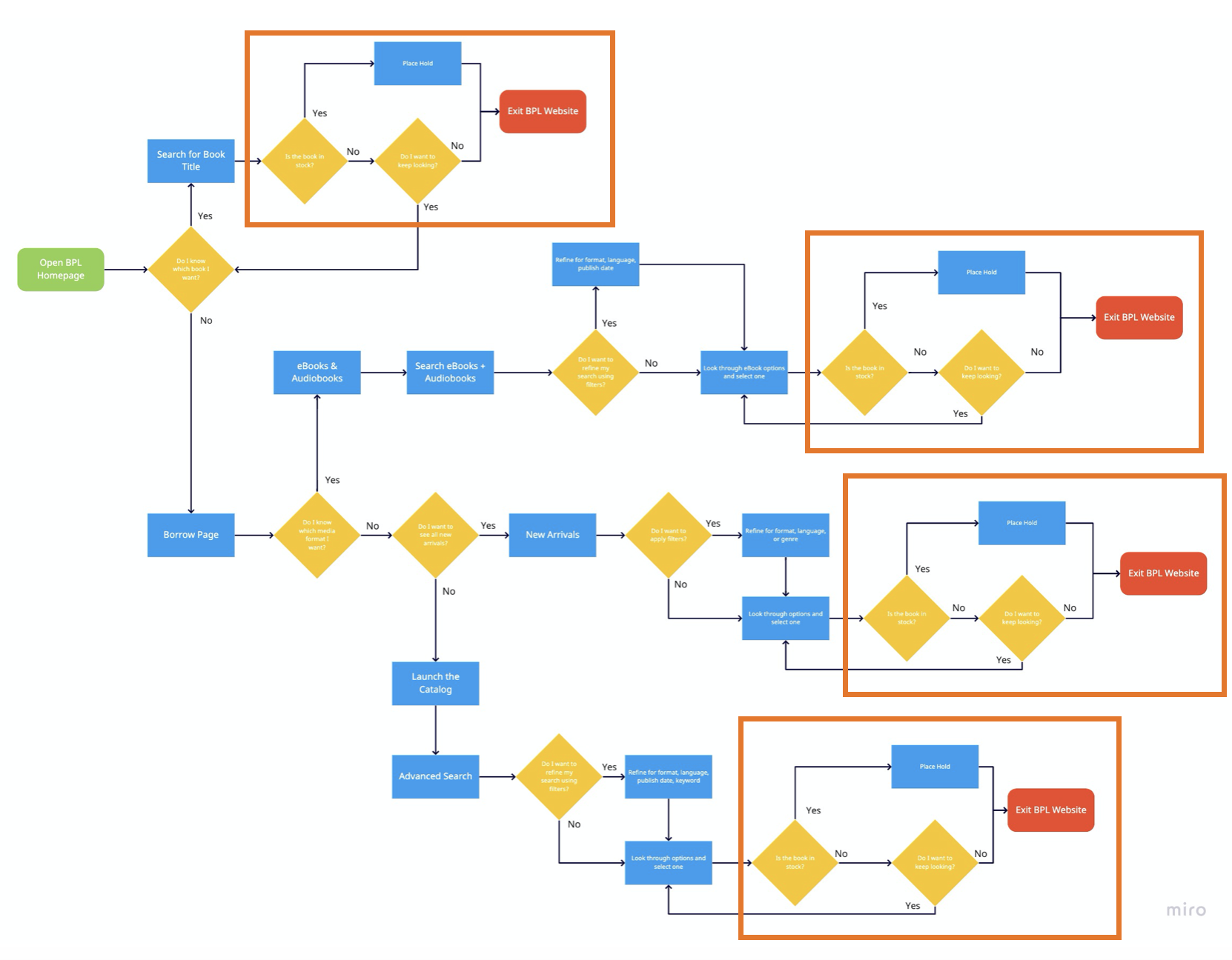
We created a user flow of the potential paths a user can take through the existing website navigation when trying to find a non-fiction, newly released title that is available now.
Currently the user can only see if a title is available at the end of each potential path, once they have clicked on a specific book. Boxed in orange are the repeated loops of determining whether a title is in stock, at the end of each flow path.
This can be frustrating for users as they need to choose a book multiple times before they can find one that is available. To remove this frustration, it would be helpful to inform users whether a book is in stock earlier in the flow path.
The Updated Navigation
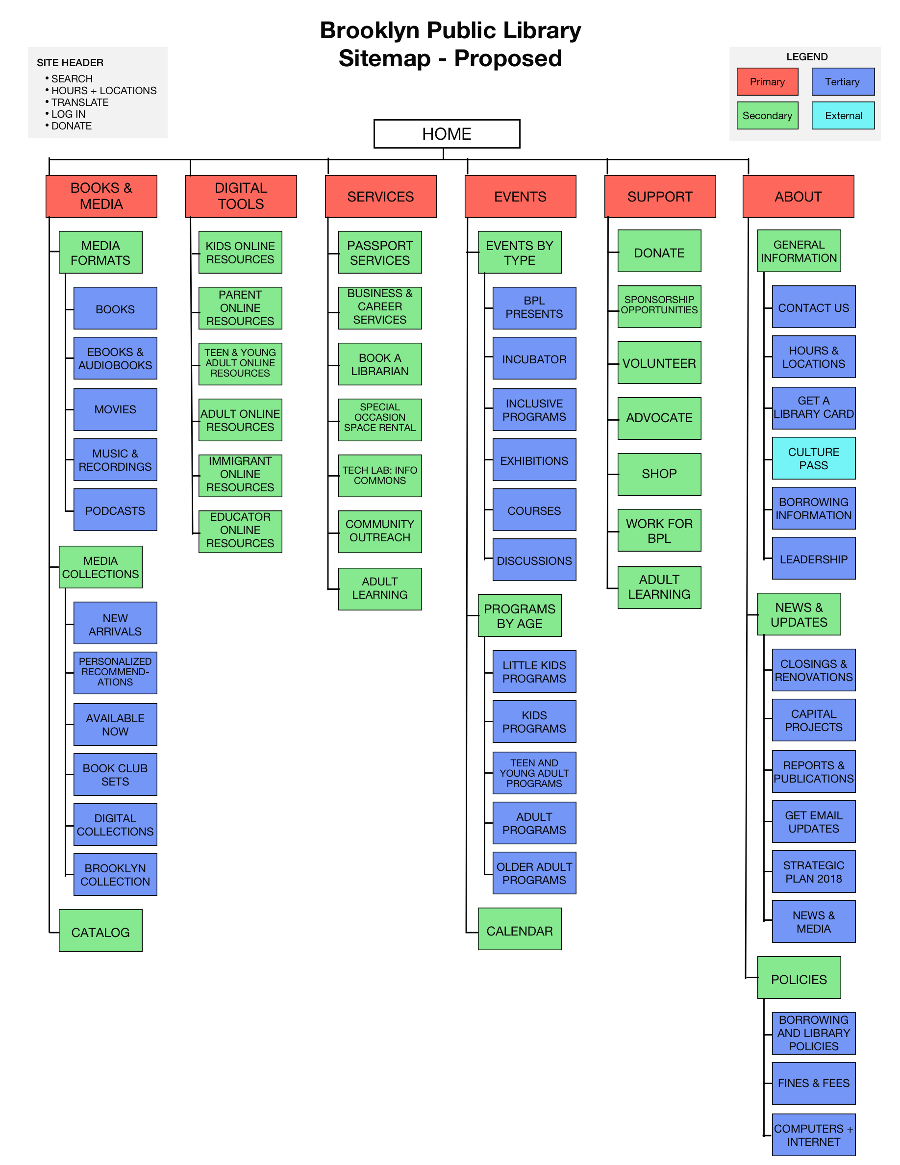
Site Map for Proposed Website
Based on our user research, I created a proposed site map that aligns with users’ mental models more. I did this by expanding the primary navigation from 4 categories to 6, to better organize products and services. I also used subheadings in the secondary navigation to group together items and make them more digestible.
Test, then Test Again
To evaluate our designs for functionality and intuitiveness, we conducted a tree study and a closed card sort on the proposed navigation design.
Tree Study for Proposed Website
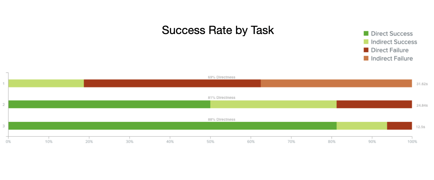
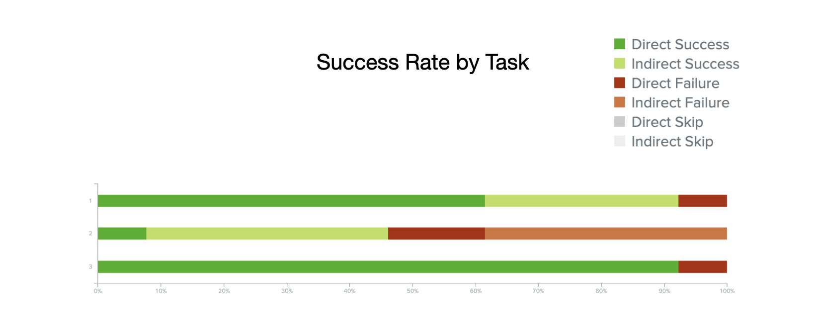
A second round of tree testing was conducted to compare the proposed navigational structure for BPL with the existing navigational structure, using the same three tasks.
Task 1 (Browse non-fiction latest releases) had a significant improvement in success compared to the first round, increasing from 19% to 93% success.
Task 2 (Find a virtual book club) was less successfully this round, indicating the changes made to the navigation made it more difficult for them to complete this task. Users did not know which primary navigation option to click on, some wanted to find it in Events, but others thought it would be in Books & Media, Services, or Digital Tools.
Task 3 (Make a single contribution of $35 to the BPL) had slight improvement in success as more users were able to directly complete the task. In round 1, there was 81% direct completion and in round 2 there was 92% direct completion.

Card Sorting for Proposed Website
In this closed sort, we evaluated our proposed navigation design to determine if users sorted a higher percentage of cards inside the primary navigation items we defined as compared to the existing navigation.
56% of cards were placed inside the proposed primary navigation, while 44% of cards were placed outside of the existing primary navigation. This is a significant improvement from the existing closed card sort of 36% inside, 64% outside. However, there is still room for improvement. Most participants agreed with the Books & Media, Events, and Support Category. Digital Tools and Services proved confusing, with cards swapped between them.
Introducing the BPL Navigation Redesign

Primary Navigation
Expanded to 6 categories, the primary navigation now runs horizontally at the top of the page rather than vertically on the left side. The search bar has been made less prominent and moved to the utility bar to encourage the use of the primary navigation.

Secondary Navigation
Hovering over or clicking on a primary navigation item will open the secondary navigation menu. Secondary navigation items have been organized under sub-headings to group the numerous items together.

Breadcrumbs and Color Coding
As the user navigates through the site, they will know where they are through the addition of breadcrumbs below the BPL logo. Additionally, color coding has been used to group all pages within a primary navigation category; Books & Media are green, Digital Tools are periwinkle, Services are red, and so on.
To help our persona Kelley find titles that are available now, we added a filtering option under new arrivals for Available Now.
Our Navigation in Action
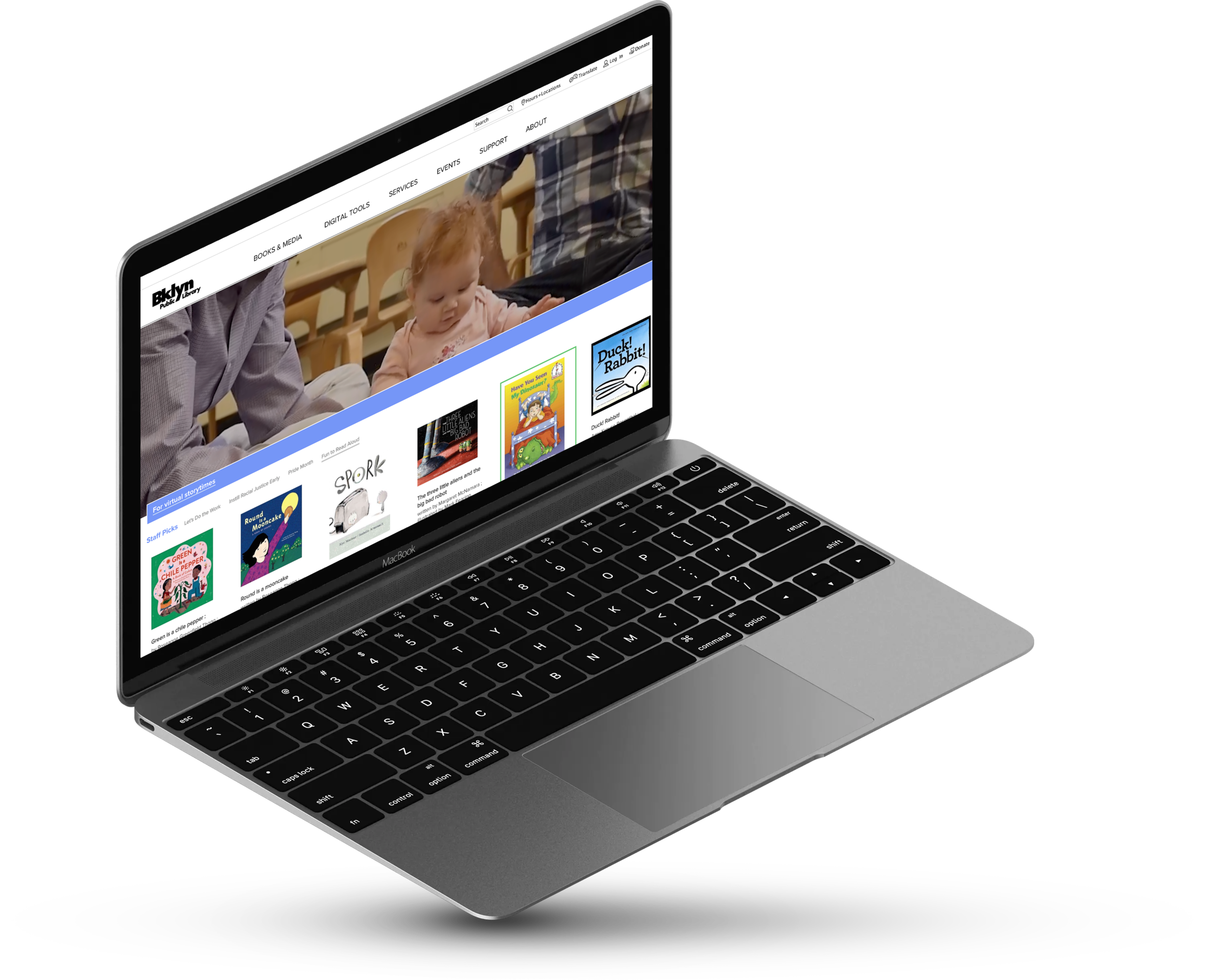
Click play to view the prototype and how Kelley could find a non-fiction, new arrival that is available now.
Next Steps
To continue to iterate on this design to improve it, we would conduct the following next steps:
Relabel items in the navigation that would be more intuitive and easier to understand stand alone. For example:
Digital Tools > Online Resources
Services > Library Services
Support > Support the Library
Incubator > Innovative New Programs
Move items that users did not feel belonged in current proposed structure. For example:
Users were confused on where to find a virtual book club, many wanting to find it in the Books & Media tab.
Run round 3 of closed cart sorting and tree testing to validate or invalidate if changes made to the navigation helped users find information more easily
Conduct usability testing with the updated prototype using the same three tasks given in tree testing.
Retrospective
Overall, this was a very interesting project to work on. The library provides so many amazing resources to the community around it, but people need to be able to find them in order to make use of them. With such a vast range of services, everyone has different views on how to organize the information. But one thing they agree on, the current website isn’t cutting it for them.
See what your local library can do for you!